By Jackie Cook
What should I do with your strong, manly, spirited sketches, full of variety and glow? How could I possibly join them on to the little bit (two inches wide) of ivory on which I work with so fine a brush, as produces little effect after much labour?
Jane Austen, Letter to J. Edward Austen, 16 December, 1816.
One feature of Emily Cumming Harris’s work which is easily overlooked when considering her artistic legacy is the humblest part of the pictorial arts: mounting and framing. Yet evidence of how much time she spent doing just this shows where her daily focus lay. I suggest that a closer look at the ways it interacts with her entire artistic vision will show that this, too, has something to say of the artist, and the woman.
When I first encountered both her writing and her art, I was struck by the many ways in which she commented upon the limitations on nineteenth-century women’s independent social mobility. It was not an uncommon lament. Jane Eyre, for instance, gazes from her window and longs for release:
I desired liberty… for liberty I gasped… “Then,” I cried, desperate, “grant me at least a new servitude”
Jane Eyre, Chapter X, p. 118; the 1890 edition
Jane Austen reminds her brother that she works on ‘a little bit (two inches wide) of ivory.’ These limits were a central part of the female condition, established tropes across many artworks and texts, and were formative influences upon women from mid-century on.
While Emily Cumming Harris, writing and creating art from the 1860s forward, did herself ‘break out’ in many ways – not least of them the sketches she made in Nelson’s newly-discovered North-Western caves – from day to day her life was as restricted as any other woman’s of her era. This experience becomes notable though, when the techniques used literally to ‘frame’ her own artistic vision: the card-mounts, and lines, and the multi-image composition forms she uses with landscapes, reveal subtle but distinctive ways of breaking bounds.
Consider the following:
1. The ways the flora of her botanical sketches and paintings trail beyond the field of the study, and out towards the frame.
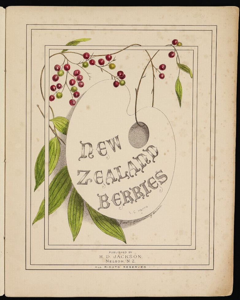
The most powerful examples of this are in the covers of her three collections of flora: New Zealand Flowers, New Zealand Berries and New Zealand Ferns. Here, these techniques are at play to the most extreme levels.
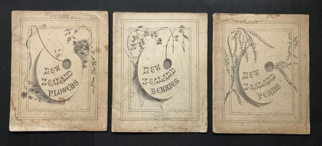
Foliage winds in and out of the mounting lines, and through the artist’s palette in the centre. The images are framed multiple times, as if stepped forward, creating the effect of their reaching out to us as viewers – the palette especially offering itself to our hand. It makes the image what semioticians would call ‘scriptible,’ or open to our participation, offering us a collaborative vision – a shared artistic experience. It’s almost as if the artist is saying to us: ‘I wound all these elements into this new form of being: you unwind them, and you’ll regain the experience of viewing these flora in situ.’
This is the core of the Romantic vision, being able to recapture the original moment, so the reader/viewer can share the instant of its inspiration. Like Wordsworth’s verbal encoding of his own perceptions of nature’s glory, Emily Cumming Harris’s visual transcriptions of New Zealand scenes and botanical species are framed and focused for us, so that they too
… flash upon that inward eye
Which is the bliss of solitude;
And then my heart with pleasure fills,
And dances with the daffodils.
The new, exotic, sometimes near incomprehensible flora that Emily Cumming Harris is recording, still becoming familiar to the colonial eye, are literally coiling themselves into their viewers’ developing appreciation of a whole new environment; a extended repertoire of the sublime.
2. Her use of multiple mounting lines, suggesting a visual drive towards depth of field, as if the image were being rendered three-dimensional.
Mounting lines prepare an image for the convention of centring it on a page – something nature itself never bothers with; or else surrounding it with card mounts, and frames – heavy ones, too, in the Emily Cumming Harris era. This is the Victorian mania for organisation and cataloguing at work: collecting, naming, creating taxonomies. Everything is cut out, and cleaned up, and stored away. Every image knows its place, neatly framed for its proud owner to display, card-mounts allowing that extra space beneath the glass for ‘real’ specimens: pinned insects or butterflies, ‘pressed’ leaves or flowers, to be displayed.
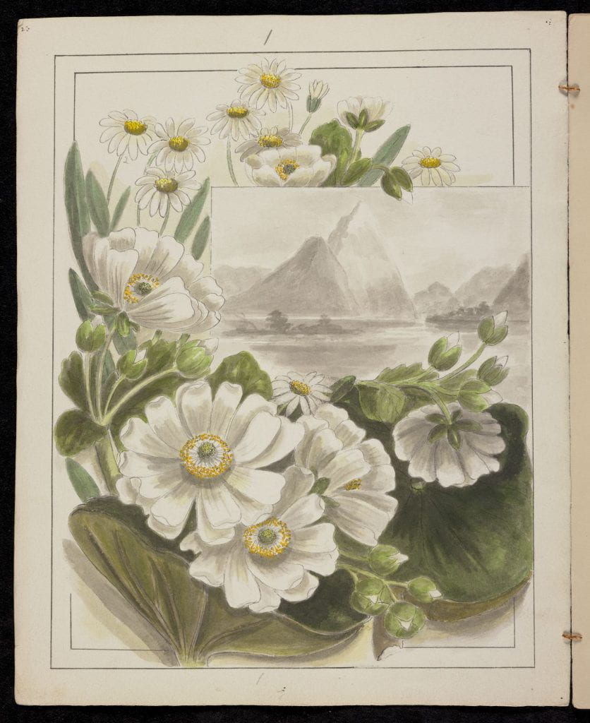
Yet multiple mounting lines both intensify this control over the central object, and give it back aspects of the life from which it has been cut away. They create an illusion of depth, inviting viewers to step into the image – or to feel it stepping out towards them. They build in an illusory re-animation of the original subject.
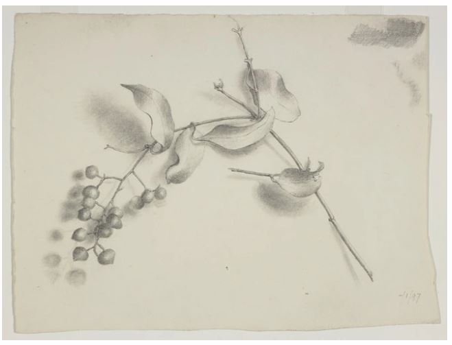
3. The detailed shadowing of the botanical drawings, each leaf and stem and flower carefully shaded beneath.
When I recently had a print of Sophora tetraptera framed, I discovered that the combination of this shadowing work with a mount, and non-reflective glass, lifted the entire image into an illusion of being fully tangible. My eye becomes convinced that the flowers of the kowhai are actually painted onto the under-surface of the glass, like those Chinese glass scent-bottles which are painted on the inside. The fine-etched lines on the petals make this even more compelling – and it makes a kind of sense of the shadowing lines of the flowers and leaves and stems, as if they are throwing that shade onto the paper beneath them. And yet, when I tried to photograph the effect for this blog, that whole vision disappeared! It has to be seen in real-life. Transferring it back into yet another image returns it to a disappointing, two-dimensional flatness.
These multiple lines are contradictory. In one way they double, and sometimes treble, the ‘cutting away’ of the image from its natural space.
But Emily Cumming Harris breaks open the frames. I say this move is ‘contradictory’ because when she first multiplies the mounting lines: two or three at a time, instead of locking-up the framing even further, it adds depth, and so accentuates the three-dimensionality of each image. The lines become steps of depth: they draw us in, even as they keep the image safely nested into its page or into its frame.
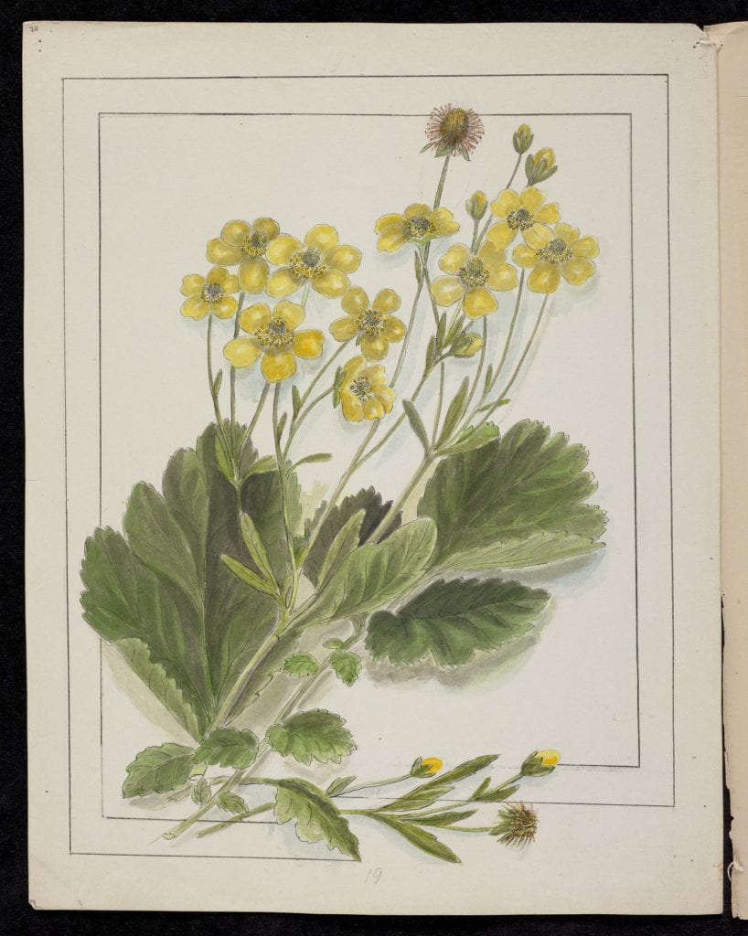
What happens then, when these lines are ‘opened,’ as Emily Cumming Harris so often does?
First, the flora ‘escape.’ They trail over the lines, as if too big and too alive for their frame.
Then the viewer escapes too – into the image. We move, with our line of sight, into the picture. Nothing, it seems, can be safely contained for long.
5. Multi-framed or compound pictures, using the same techniques as the new pictorial magazines.
These images are often arranged from bottom to top, in a sequence which draws the eye from near to far; from foreground to vista. It creates a small journey for the viewer – one which Emily Cumming Harris herself may not always have been able to take.
One of the problems in ‘reading’ image composition in the ways I am attempting here, is that there has been little formal study of how nineteenth and twentieth century printing changed the ways we present images. As photographic reproductions began to appear in print, the relative cheapness in comparison to the engravings which they replaced meant that multiple images could be used. As the page layouts were being designed, images would be cropped to fit into the print columns. ‘Compositors’ would create an alluring mix of narrative and sequenced pictures, or even flow illustrations into the text. Framing lines would be removed, to let the key elements of an image reach out into the text, the background of the image cropped or shaded away, to gain extra space.
Artwork and photography from a 1906 edition of the magazine Chums, for boys, shows these techniques at work:

Often, illustrations appeared in ‘keyhole’ or ‘aperture’ format: a sequence of visually interesting frames, circular, elongated, or with enlarged details, forming a compound experience of the subject in question.
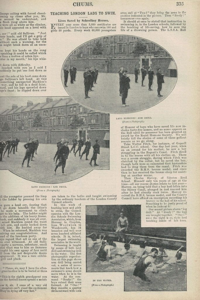
Like the fad for stereoscopes: the double-image parlour-viewers that created the illusion of viewing in 3-D, these images ‘invited you in’ to whatever they portrayed – and so does Emily Cumming Harris. She ‘walks’ you into her botanical pictures, from a foreground with a close-up detailing the flora in question, to a mid-field which ‘bridges’ you or flows you on to a far vista.
What emerges overall is a sense of a serial semiotic encoding at play. There is a drive towards mobility, lifting images off their surface in a desire to render them three-dimensional and mobile.
Small fractures are opened up inside the images and all around them, through which the viewer’s eye can move, entering the original space of the image’s capture. These are the narrowest of visual ‘escapes,’ but escapes nonetheless.
I suggest that this shows three things about the artistic vision behind these works:
1 A powerful representation of a desire for mobility through the landscape.
2 An interest in the developing new field of the mobile image, just as firstly: magic-lantern illusion machines, and then cinematography, were developing.
3 The emergence of what could be called a psycho-semiotic urge, projecting a dream of real movement into these otherwise ‘still-life’ images.
What I find even more fascinating is that this arises in the most disregarded field of art: the hack-work of mounting and framing.
It’s worth remembering the conditions these images lived in.
The flora illustrations lived in books. They had to ‘leap off the page’ to do their work. Thus the shadowing, trailing, split mount lines, and receding vista multi-scenes.
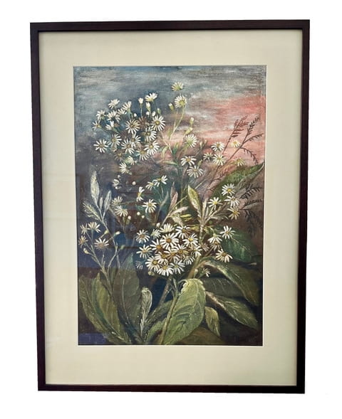
The paintings were placed in dark, heavy, wooden, Victorian picture frames. They were on the walls of rooms with dark-toned, ‘busy’ printed and flocked wallpapers, in tones of maroon, Prussian blue and acid green; above dark-stained floorboards with Turkey rugs. They were viewed in conditions of light restriction, day and night, from lace curtains and velvet drapes, to candles and oil lamps.
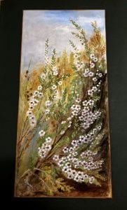
Once more Emily Cumming Harris builds in ways of ‘animating’ her works, throwing the images forward, with glowing skies, snow-capped peaks, or shimmering seascapes.
The added atmospherics of these ‘vista’ elements help light-up the botanical images – especially in the long/high/narrow paintings or ‘panels’, a format which I remember from the homes of all my own Victorian Great Aunties (I had dozens of them!) Like Emily Cumming Harris, they lived on into twentieth century poverty, and never changed their décor. Long, narrow, heavy-framed paintings were used either side of the mantelpiece or dining room dresser, and on the stairs. None of those were illuminated spaces. These were images that had to force their attention upon you – often as you passed by, in hallways or on stairs.
In summary, I suggest that the experience of viewing works by Emily Cumming Harris has to be seen in the context of their production, and their consumption.
These are heavily prescribed art forms: flora illustrations for folios or wall-paintings, with expectations about how they would be represented and prepared for viewers.
Again and again however, Emily Cumming Harris finds ways to defy those expectations: to meet them, yet also go beyond. Like the curious tonal shifts in different iterations of the hand-colouring work she did on her flora engravings, Emily Cumming Harris creates variation and diversity in the heart of repetition, movement in stillness, and minute entry and exit points in every work.
There is a powerful vision hidden here, where margins begin to unravel, and what at first glance seems prosaic and insignificant is unleashing something of much more interest.
Thank you for such a fascinating article Jackie, very thought -provoking. I did enjoy the allusion to the Romantics and spent ages tracking between your explanations and the illustrated examples, legerdemain indeed. Also, I had never previously considered the implications of the viewing context but it struck a chord as yes, so much of the domestic art we saw in our early years was light-restricted, situated either in the heavily draped ‘best room’ or parlour or in somewhat foreboding dark hallways and long corridors.